
The Color Palette
Journal Entry no.004
When we set out to design these frames, we weren’t just picking colors—we were building moods.
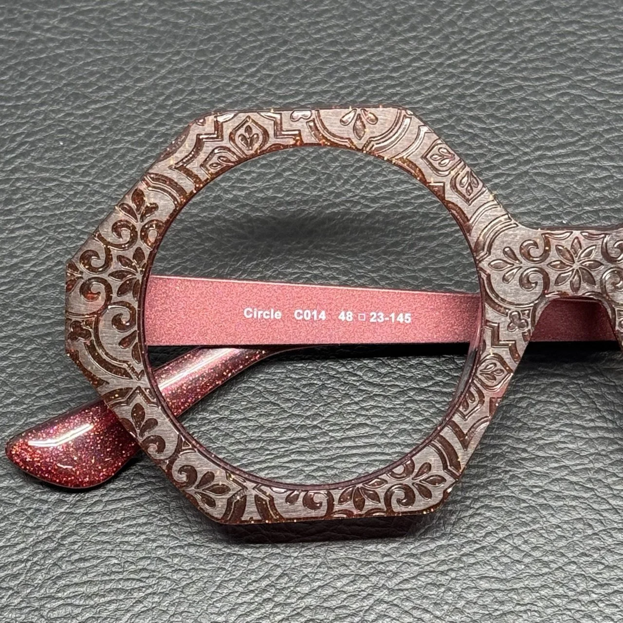
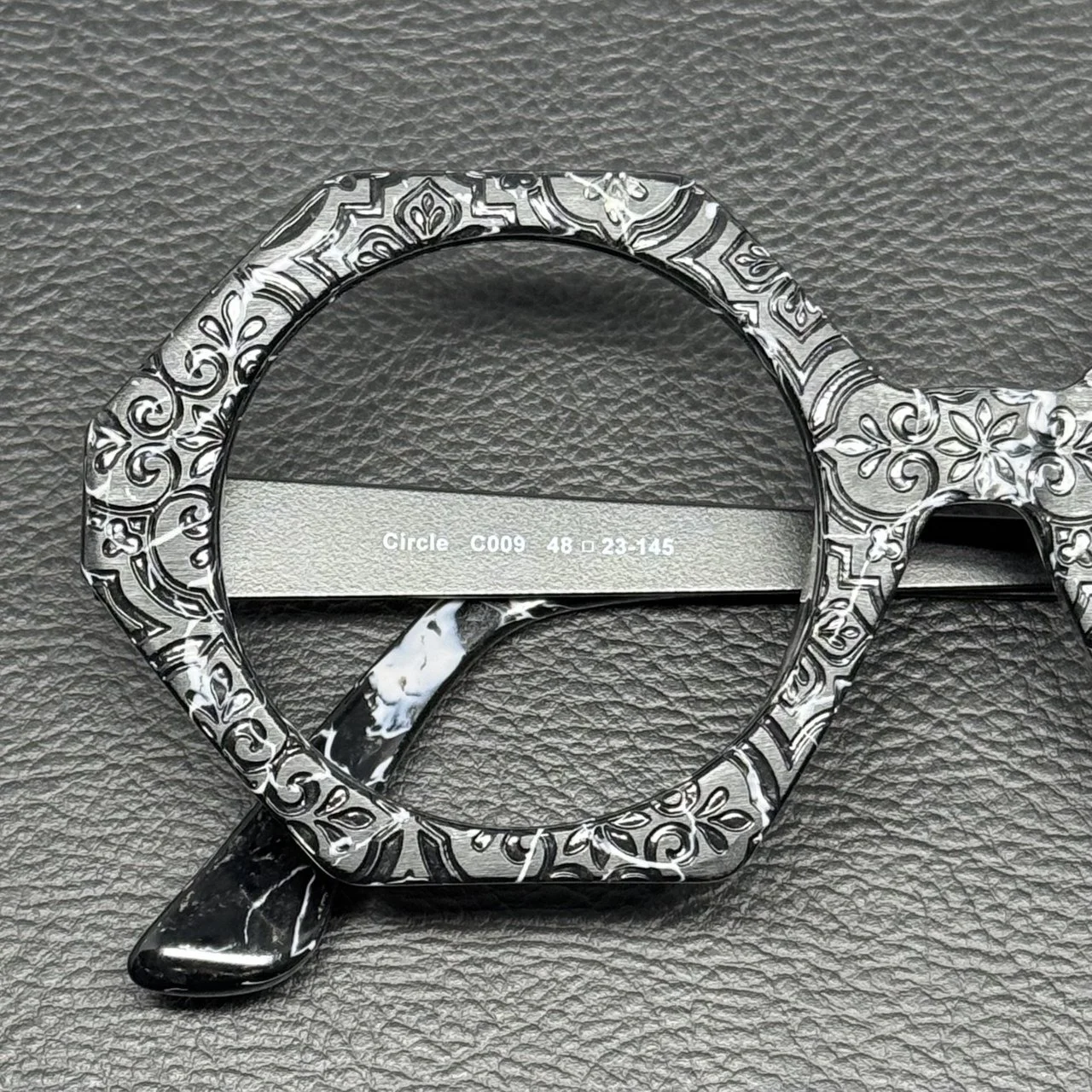
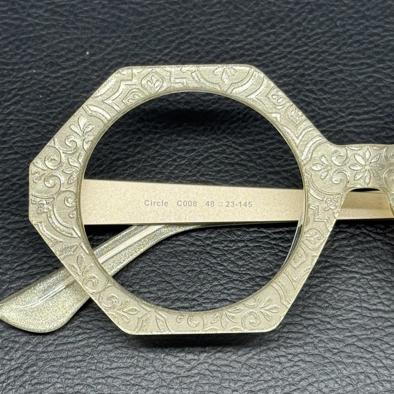
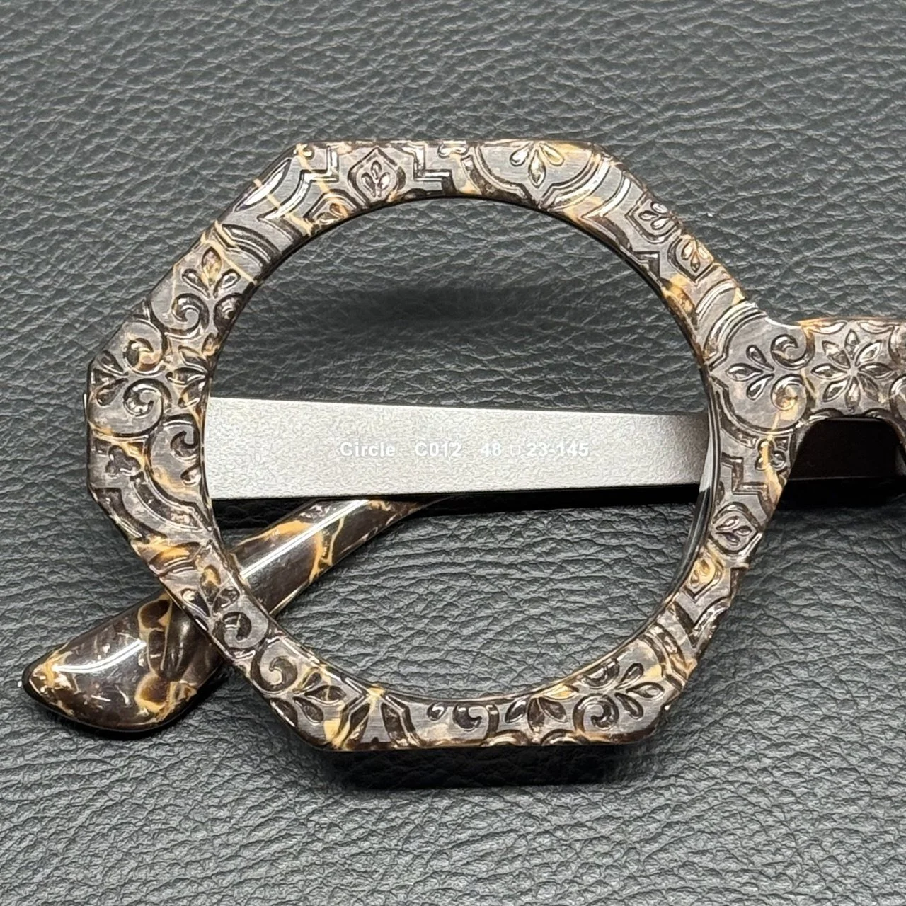
Each color was chosen not just to complement the engraved texture, but to activate it. These aren’t flat shades. They shift. They reflect. They respond to light in ways that make you stop and look again.
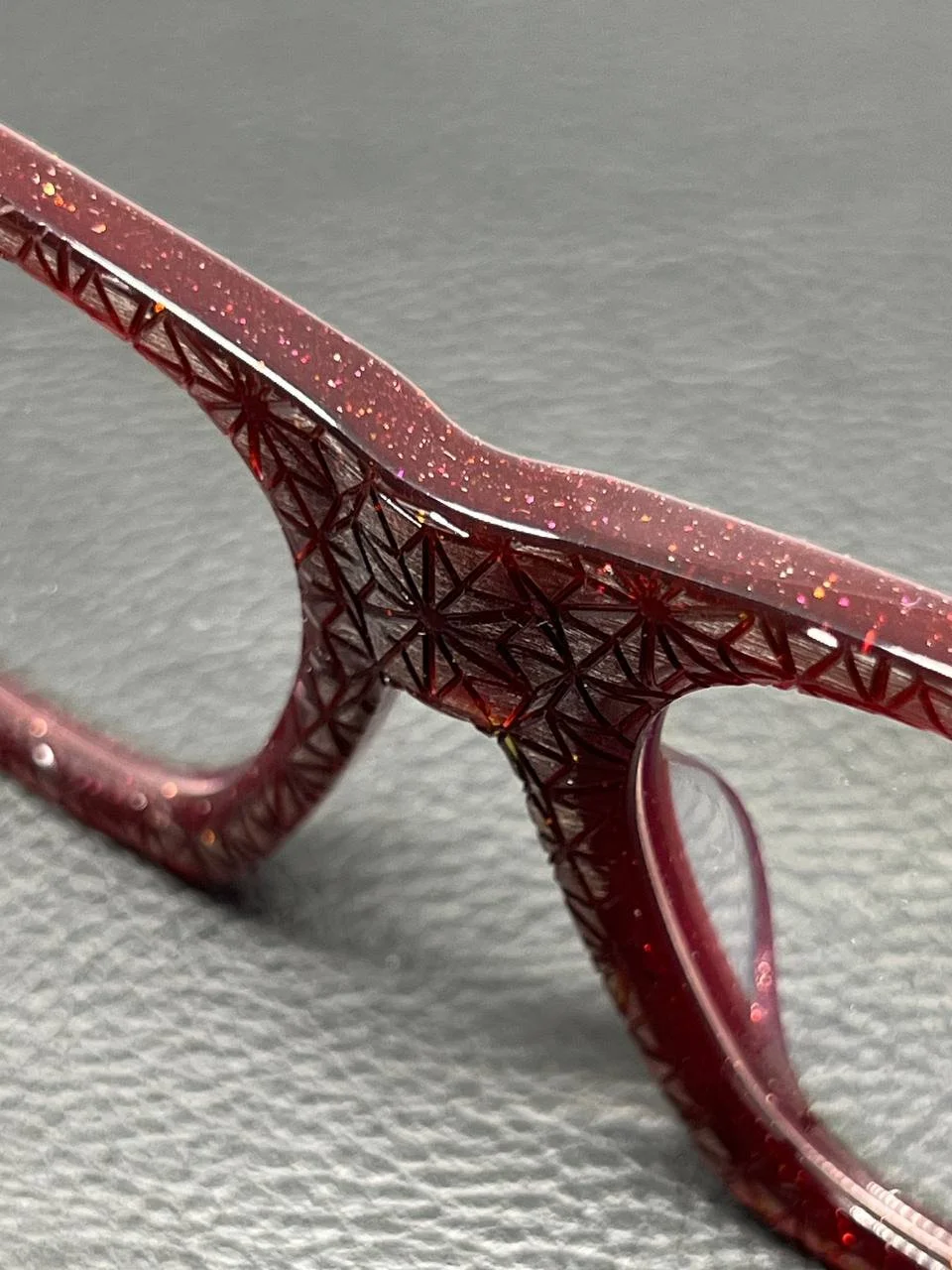
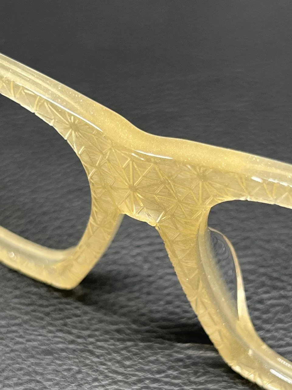
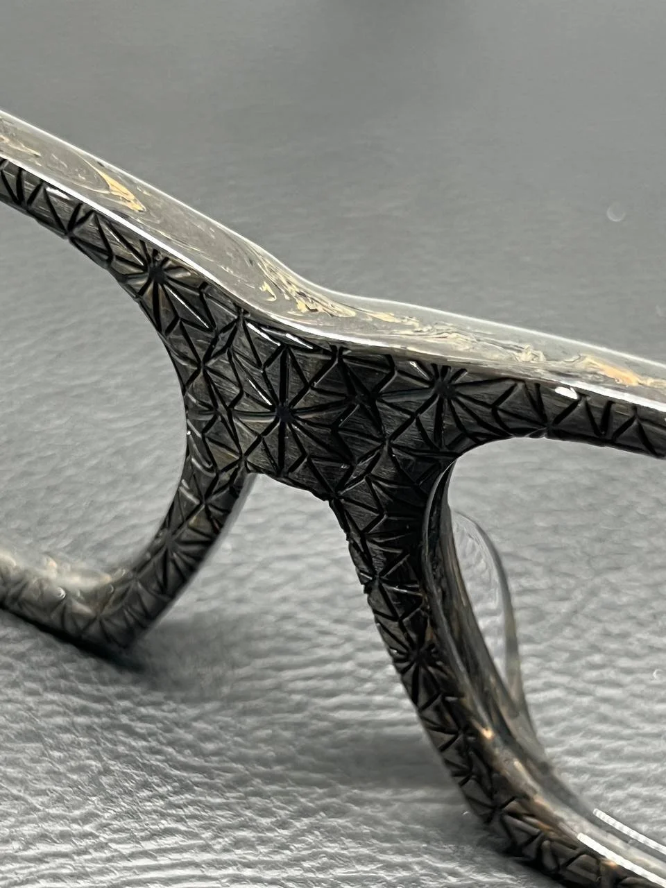
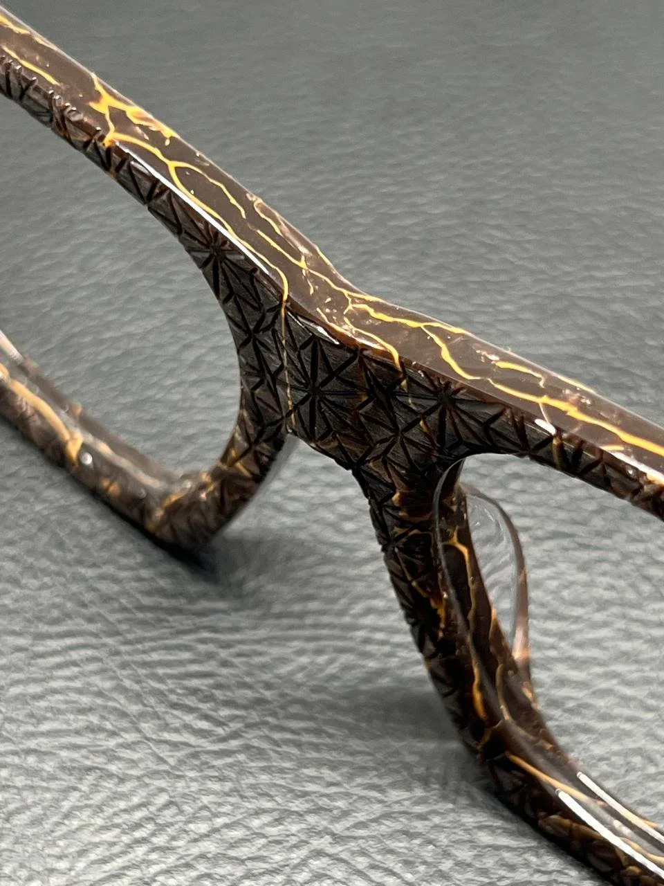
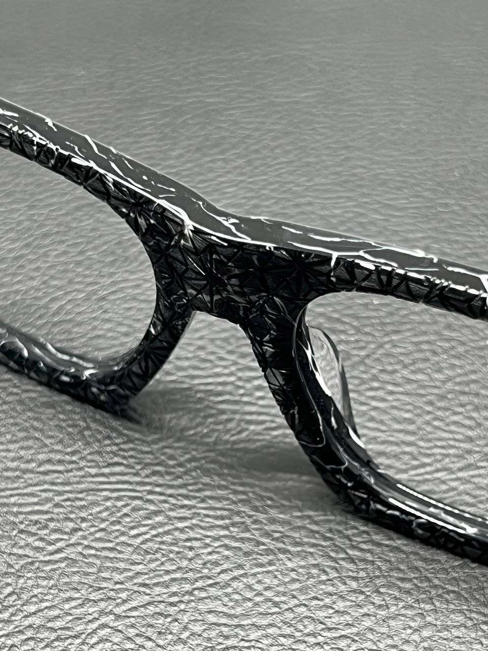
We wanted the black to feel like volcanic rock—dense, layered, alive. The gold? Like sunlight filtered through old lace curtains. The marbled tortoise has veins of fire and ash running through it. The red carries a shimmer you’d expect from a glass of wine held up to the sunset. The champagne tone glows like it was dusted in powdered pearl.
We tested dozens of versions. Some were too loud, some were too flat, some killed the texture. These made it. Not just because they were beautiful, but because they had character.

Every color we chose had to feel lived in, not manufactured. Like they had a past. Like they belonged to a frame that could carry a story.
These aren’t colors. They’re memories waiting to be made.